
Digital branding and web solutions that make a difference.
Build your brand and engage with customers.
Bond Digital is an integrated agency with an extensive experience developing brands and marketing strategies. We work collaboratively with our clients to build brands, design websites, and create campaigns. Our team designs and executes the creative, content, and development of digital and traditional marketing assets.
Explore our work


STRATEGY
Strategy is the foundation and roadmap that drive successful launches and meaningful outcomes.

DEVELOPMENT
Imagination comes to life in creative, design, messaging and development.

IMPLEMENTATION
Ideas become reality as we activate the work to bring your project to market.

MANAGEMENT
Websites, campaigns and brands stay fresh, active and effective with regular maintenance.
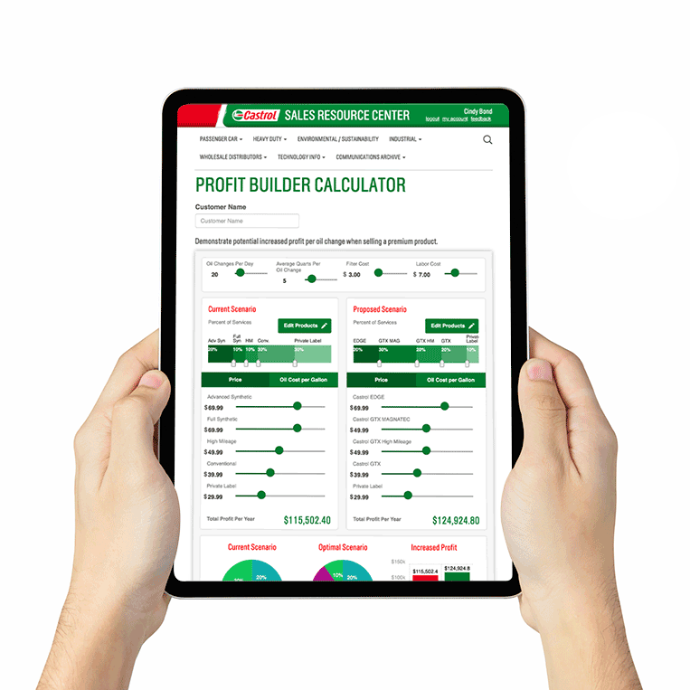
Clients We’ve Worked With